27.6.07
Casino Royale opening credits
Being a huge James Bond fan, I was always going to be sceptical watching Daniel Craig's first performance. This scepticism started from the moment the opening credits began. After initially hating everything about them, from the cheesy americano theme song to the tacky use of the playing card suits, my feelings towards what is an essential part of every Bond film have changed dramatically.
Although the Casino Royale opening credits follow a very similar theme to most of the other Bond films, with the focus being on guns, fights and women, they have a very different style. The almost 2D graphics are very striking and some very interesting animated scenes are created. The way the bodies shatter into many pieces when they are hit is fascinating. The detailed use of playing card suits is also interesting, with many self-similar shapes being created.
26.6.07
Vodafone
As far as Mobile Phone companies and Networks go, Vodafone have been very quiet for quite sometime. To get themselves back into the game they had to come up with an advert that would stand out and get people talking, as well as demonstrating their brand values.
Their new 'Make the most of Now' advert has achieved all of these things. The clever graphics coupled with the joyful, friendly soundtrack (from Bambi) make it catch the viewers eye and hold their attention for the duration of the showing. I have watched this advert with a number of people and so far not one of them has spoken or looked away from the screen while it was running. The scenes in the advert of people all rushing around to get out of the rain have a real sense of community, which is what mobile networks are essentially all about. To make it complete, the voice-over is spot on. Dame Judi Dench's voice has a real air of authority, as well as giving a soft, and very trustworthy feel.
The style of the commercial, with it's busy yet silent scenes, along with the calming soundtrack, make it fit in perfectly with the other popular television adverts of today, whilst still maintaining that edge to make it stand out from the crowd.
Turning The Place Over

The UK's Capital of Culture's latest installation sees the former Yates’s Wine Lodge building, opposite Moorfields station in Liverpool, become one of the most eye-catching and daring pieces of art commissioned in the UK for some time. Sculptor Richard Wilson has cut out an egg-shaped section of the derelict building’s front and fixed it to a giant pivot. The facade will rotate like a huge opening and closing window, giving passers-by a glimpse of the interior.
While in Liverpool recently, I went along to see this piece of artwork. Even from a distance, just seeing a section of the side of a building almost floating was amazing. Up close the impact is even greater, when the sheer scale of the facade becomes apparent. Costing £450,000, this installation has caused some uproar, with many people suggesting that there may have been more pressing issues that the money could have been spent on. However, in a world where endless amounts of money seems to be spent dealing with illegal immigrants and prisoners, I am very happy to see that occasionally some of the public funds are still invested in usless, and yet awe-inspiring visual stimulation. As far as architecture goes, this is one of the most impressive sights i have seen in the UK.
17.6.07
Keith Haring

The work of Keith Haring has always interested me. His use of bold lines and active figures often carry poignant messages of vitality and unity. Throughout his career, Haring devoted much of his time to public works, which often carried social messages. He produced more than 50 public artworks between 1982 and 1989, in dozens of cities around the world, many of which were created for charities, hospitals, children’s day care centers and orphanages. The simplicity of his 2-dimensional drawings somehow convey real movement and emotion.
It was the influences behind Haring's work, along with his bold style that played a major part in another of my A level projects where I chose to produce ideas for a campaign promoting launch of the anti-racism in football campaign, 'Stand Up Speak Up'. Below is an example of one of my ideas.

Barbara Hepworth Sculpture Gardens, St. Ives
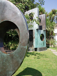
Dame Barbara Hepworth created sculptural forms derived from nature. She was especially inspired by the sea-washed rocks near her home in Cornwall. She was a key figure in the abstract movement in Britain. Her adherence to abstraction was lifelong and drew on geometric as well as organic shapes. She introduced into England the idea of piercing the solid mass of sculpture with a "hole," making the object more transparent.

I have visited the Hepworth gardens a number of times over the years during my visits to St. Ives. I love the style of her work and the way in which her often huge sculptures, made of materials such as stone, bronze and wood, seem to sit perfectly in the natural settings in which they are placed. It was the work of Hepwoth that inspired much of my A level Art work. The sketch above was one I did while sat in the Hepworth gardens. This sculpture below was another part of my A level work.

The Tate, St. Ives

I have visited St Ives in Cornwall with my family since I was born. Its been that long that I even remember the Tate being constructed. The architectural design of the building caused some controversy with the locals due to it's modern and contemporary appearance. Locals worried that it would not be in keeping with what is in effect a largely unspoiled Cornish town.
The first time I saw the finished building, I was amazed. The ultra-modern front entrance to the tate is its main feature. The smooth, rounded architecture fits in perfectly with the landscape that it is situated. Looking out across Pothmear Beach and onto the ocean it stands out on the beach front.

The Tate's circular foyer is also a great architectural sight with it's huge glass panels adding to the modern look.

It was the Tate that inspired me, at the age of 6, to become an architect. This then lead to my interest in the visual world and in turn, onto design.
14.6.07
Audi A5 - rhythm of lines commercial
Almost immediately after publishing my post on the 'line rider', I saw this commercial for the new Audi A5. The advert just oozes style and in my opinion stands out from any car adverts of recent time. It is not only stylish, but also extremely innovative and unique as far as today's television advertising goes. Audi's website states that the 'Audi brand' is:
"progressive design, groundbreaking technology and enhanced driving pleasure... Stylish and modern, innovative yet timeless, unique design, and dynamic sports appeal".
For me, the latter part of this brand description is effectively an excellent evaluation of the rhythm of lines commercial. In other words, Audi have very successfully created an advert that exhibits all of their brand values and in turn gives a perfect image of what the new A5 is all about.
Other recent car commercials worth keeping an eye out for are the adverts for the new Mercedes Benz C-class, and the new Lexus advert with the water droplets running along the car.
Lucas Purdy

The bold and simple style used by Lucas Purdy for the artwork on Snow Patrol's 'Final Straw' album gives a great effect. Forgetting the use of this image, and just looking at it as a style of drawing I think it is awesome. The style is perfect for snowy, winter scenes but can be adapted so easily to different images. Similarly with the work of Karen Taylor (see earlier post), I am struggling to find much information or many other examples of Purdy's work so any educated comments would be appreciated!
Below is an example of how I have used Purdy's style to create my own snow scene. This shows how easily and successfully the style can be used:

Line Rider - Jump on it
This video reminded me of the 'La Linear' videos posted by Paddy on the graphics team's glog. The simple graphics are excellent and the movements of the figure fit in very well with the beat of the track. Searching for Line rider on youtube brings up many more excellent examples of this. What do you think?
13.6.07
David Ford CD artwork, by Karen Taylor
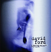
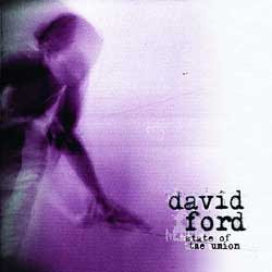
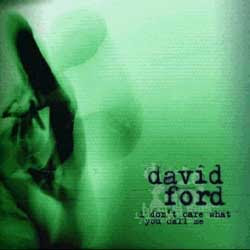
These are examples of singer/songwriter David Ford's album artwork. I find these graphics fascinating. The almost ghostly figures along with the vivid colours give a real feeling of fantasy and the supernatural. Although I dont feel that this description of how I view these images echoes the style or the sound of his music, I think upon hearing some of David Ford's music it becomes clear that these are very suitable images for his CD artwork. I have tried looking into where the images are from and have found that they are from Karen Taylor's "paper dress performance III". I am still looking more into this but am struggling to find any further information on it or on Karen Taylor herself. If anyone finds anything or knows more on the subject then please leave a comment.
10.6.07
Guillemots website
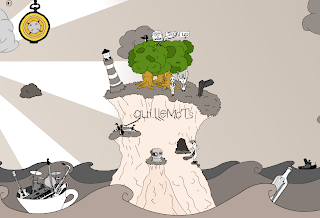
The style of Guillemot's website is one that I find excellent and is a great example of the stylised 'cartoony' designs that are very popular with a lot of recent advertising and promotion aimed at youngsters. The layout of the website is awesome and as you move the mouse across the page, the scene moves across with you, revealing more and more features that pop out of the scenery. I think this is a very clever website design and one that is perfectly in-fitting with the image that the band have and their style of music.
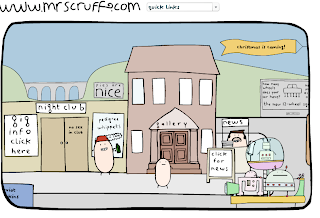
A very similar website layout can be seen on Mr Scruff's website, only with a differing cartoon style:
Kung Fu Hustle
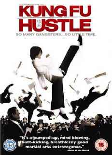
I watched this film only recently, and I am very glad I did. The tagline for the film states that the film is 'A new comedy unlike anything you have seen before' and this is exactly what it is. The film is littered with exaggerations, serious situations and comic plots. Kung Fu Hustle features a type of humour known in China as 'Mo lei tau' which originated from Hong Kong during the late 20th century. It is a phenomenon which has grown largely from its presentation in modern film media. Its humour arises from the complex interplay of cultural subtleties significant in Hong Kong. Typical constituents of this humour include nonsensical parodies, juxtaposition of contrasts, and sudden surprises in spoken dialogue and action.
Set in China in the 1940's, this film is based on a wannabe gangster who aspires to become a member of the notorious 'Axe Gang'. His efforts soon bring the gang to a slum called Pig Sty Alley, supposedly the only place safe from the Axe Gang due to the people living there being so poor. This results in a huge turf war, involving characters such as an obnoxious landlady and her apparently frail husband who exhibit extraordinary powers in defending their turf.
This spoof type kung fu movie has some amazing scenes, the most impressive of which comes during a face-off between the film's three main 'good guys' and two Axe Gang assassins called The Harpists. The assassins have an acoustic instrument which, when the strings are plucked, sends out knives and all other kinds of weapons. I would strongly recommend viewing this film, for this scene alone it is well worth it!
Here is the mentioned scene, however this poor quality youtube video does not do justice to the impact and impressive nature of the scene.
7.6.07
Olympics logo continued....
All of the papers from the last couple of days are filled with articles and letters complaining about the 2012 London Olympic logo. There has even been a petition started to scrap it, a petition that 27,000 people have already signed!
Although I was sceptical to begin with, the more I see it and the more I hear people complaining about it, the more I like it. It may arguably be unsuitable, but I keep looking at it and seeing the unashamed use of graffiti style, with its flexible use of bold colours and cheeky illegibility only adding to its impact. It is simply a logo for the 'ipod generation'. After all, wasn't everyone previously saying that the Olympics would be about young people?!
Although I was sceptical to begin with, the more I see it and the more I hear people complaining about it, the more I like it. It may arguably be unsuitable, but I keep looking at it and seeing the unashamed use of graffiti style, with its flexible use of bold colours and cheeky illegibility only adding to its impact. It is simply a logo for the 'ipod generation'. After all, wasn't everyone previously saying that the Olympics would be about young people?!
4.6.07
London 2012 Olympics
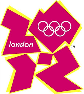
I saw on this evenings News the new Olympic emblem for the 2012 Olympics. I have mixed feelings about this. When I first saw it I thought it was a very strong visual, it is modern and dynamic but I'm not sure how well it represents the Olympic games. I did not immediately see that the shapes are meant to make up '2012'. The jagged emblem represents the games in 5 years time and apparently will 'evolve' between now and 2012. It is meant to symbolise the Olympic spirit and the ability of the Games to inspire people to take part - not just as spectators, but as volunteers, in the Cultural Olympiad and more.
According to Seb Coe, the London 2012 Chair:
"It will define the venues we build and the Games we hold and act as a reminder of our promise to use the Olympic spirit to inspire everyone and reach out to young people around the world....It is an invitation to take part and be involved."
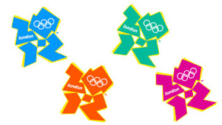
It will appear in pink, blue, green, and orange as shown here.
The emblem was designed by WOLFF OLINS BRAND CONSULTANCY. I had a look at their website and they have done some good work for a number of modern brands which is definitely worth checking out:
On their website is a link which takes you onto an interactive visual of the Olympics logo which I would strongly recommend looking at as its excellent!
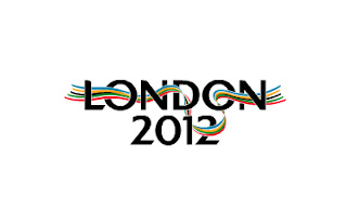
I am definitely swaying more to the much more traditional logo designed last year by Kino Design, who were in fact winners of a contest, which features a multi-coloured ribbon following the course of the River Thames and weaving through the words "London 2012".
Andy Stanfield, of Kino Design, said: "We chose the River Thames because it flows through the centre of London and is the point at which many of the city's waterways and communities meet. It is also symbolic of the people from all over the world that flow in and out of London, defining its style, personality and vibrancy. Our aim was to create a flexible logo that was integrated into the words 'London 2012' but would be strong enough to stand alone. The ribbon delivers that and can be used in many creative ways in the campaign to win the 2012 Olympic Games for London."
Any thoughts???
the Coke side of life
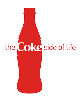
Aside from the excellent main content of the new coke advert, I find the new 'the Coke side of life' ident that appears at the end of the advert very strong. It is very clean and fresh, and the use of the coke bottle shape allows this ident to be used in a variety of adverts and promotions.
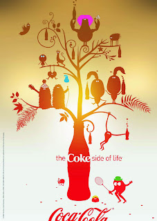
I saw a similar design to this one (above) on a billboard while travelling between Leeds and Birmingham on the train. This retro style whereby images are seen to be coming out of a bottle has become popular in a number of recent designs. The one that springs to mind is the Hugo Boss aftershave commercial.
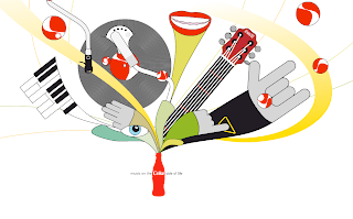
While looking at various images from 'the Coke side of life' identity I came across this website which I thought the opening graphics were an excellent example of this new retro and quite 'hippie' 70's style. (screen shot shown below)
3.6.07
'The Art Of Bond' - Laurent Bouzereau
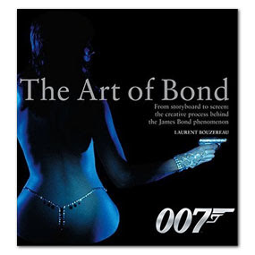
This is an amzing book and is well worth checking out or even purchasing, especially for fans of the James Bond phenomenon. The front cover alone encapsulates all aspects of the Bond films, from the violence of the action scenes to the sultry and sexual nature of the Bond women. The book is filled with stunning visuals, including on-set photographs, concept artwork, costume design, film rolls and amazing action shots.
The copy in the book consists of memories and shared experiecnes of the producers, directors, designers, and writers behind the creation of the Bond films. As well as interviews with infamous directors such as Steven Spielberg, Ridley Scott and Peter Jackson, who discuss how the Bond phenomenon has influenced their own work.
A quote on the back cover of the book from Michael G. Wilson says that 'This book is a unique opportunity to explore and realize how much artistry there is behind the films'. This is a spot on evaluation of this book.
Subscribe to:
Comments (Atom)
