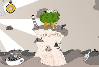
The style of Guillemot's website is one that I find excellent and is a great example of the stylised 'cartoony' designs that are very popular with a lot of recent advertising and promotion aimed at youngsters. The layout of the website is awesome and as you move the mouse across the page, the scene moves across with you, revealing more and more features that pop out of the scenery. I think this is a very clever website design and one that is perfectly in-fitting with the image that the band have and their style of music.

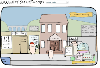
A very similar website layout can be seen on Mr Scruff's website, only with a differing cartoon style:

No comments:
Post a Comment