10.12.08
9.12.08
the new coke ad
the description of this advert on radio 1 prior to the campaigns release, was one that made the advert sound shocking and hard-hitting. in my opinion it couldn't be further from this. firstly, David Mitchell narrating - did the casting team not do their research?, as I seem to remember him being somewhat involved in the killing, cooking and eating of a dog in a particular Peep Show episode.
if I used cocaine, then the only thing that would have a chance of getting through to me would be facts relating to the damage it could do to me, and how it could affect me directly. if the fact that it is illegal isn't going to put people off, then I dont think the thought of a little dog being used in the logistics is quite going to cut it.
it's mad that the government feel the need to advertise not to break the law.
2.12.08
advertising no advertising


Back in December 2006, the mayor of the Brazilian city of Sao Paulo banned all outdoor billboard advertising, citing advertisers' unwillingness to comply with the city's rules on what sort of billboards can be placed where. Sky's use of this fact in their advert aired earlier in the year, made for what was one of the most perfect adverts I have seen. Using an images of an 'advertless' town, in an advert, to advertise not advertising. Ingenious.
subliminal
A bit of subliminal advertising by Nike. Not only are three sportsmen in Mach 3 advert are sponsored by Nike, but closer inspection of the golf ball that flies through the open window reveals a rather well-known logo on the ball. It took me a fair few viewings to spot it. I wonder how much Nike paid for this privilege.
(obviously watching this on YouTube quality isn't great so keep an eye out next time its on TV)
22.9.08
both ends of the spectrum
An absolutely genius ad from Guinness. Maybe not as cultured or sophisticated as most of their other epic tv ads. Nevertheless, beautifully subtle and streets ahead of similar 'lads humour' advertisements.
20.11.07
brylcreem "effortless"
The popularity of Honda's 'cogs' advert is evident in a number of recent advertisements. Most notably the new Guinness advert and Brylcreem's very cool 'effortless' advert. The tone of voice of this ad is just perfect for the image of Brylcreem. I saw it for the first time in the cinema. Within seconds of it starting, everyone had stopped their conversations and watched it intently right through to the end. This was followed by almost the entire audience turning to their friends and commenting on how cool it was. This concept of using a chain of events or objects to create something or get something done has an almost mesmirising effect on the viewer. They become transfixed to the screen as they are intrigued as to what it is leading to, or what is going to happen next. I expect to see many more adverts using this concept as having the viewer 'glued' to the screen is invaluble to any advertiser.
greatest advert
Guinness adverts have always been impressive and hugely popular amongst a wide audience. The Guinness surfer ad from 1999 has to be the pick of the bunch. The combination of the stunning visuals, the strong soundtrack, and the perfectly scripted (and cast) voice-over makes for an incredibly powerful and almost motivational scene. For me, it encapsulates everything that the Guinness brand stands for.
A great follow up advert was made for Guinness extra cold. This is featured at the start of the video below.
4.11.07
vanity


photos from a night out. theres always a good number along these lines, people covering their faces. is it down to embarassment, shyness, or just plain vanity?
whatever the reason, when all compiled together they make for an interesting collection of photos.
25.8.07
Mr. Hudson & the Library

Best sound of the moment and great talent...especially if you're sick of all 'bands' jumping on the indie band wagon. Something a bit different.
mr.hudson

Well worth a look: 22nd October, the Cockpit
Liverpool


On a recent visit to Liverpool I decided to take my camera into the town centre, just on the off chance there were any sights worth glogging. The rewards of are obvious. Although these images may not do the city justice, I found all of these buildings fascinating. The face of the city is very smart and quite modern, but just turning up one of the side/back streets brings a new world of incredible buildings. I love the look of these, they have such character. Character that would have been present even in their early days, but the years of vandalism and general weathering has made for some awesome spectacles. There were a large number of buildings that almost stood alone, or rows of housing or shops that just ended abruptly, creating some great sights.
the Tate, Liverpool
The Albert Docks in Liverpool has to be one of my favorite places. The architecture is incredible, it is very dated and yet at the same time has a real 'current' feel about it. Whilst at the Docks I decided to see what Liverpool's Tate had to offer...

The most fascinating aspect of the Tate for me was the views from the upper windows, looking out over the docks. Unfortunately I have not captured the quality of these views in the photo below but it gives some idea.

I will look at some of the exhibitions and works displayed in the Tate in another glog entry as I was really inspired by some of it. But in terms of the gallery itself, it was the cafe that had the biggest impact on me. Frankfurt-based artist Tobias Rehberger was specially commissioned to transform the Café into a multi-coloured three-dimensional work of art. He has created a vibrant installation that combines coloured acrylic glass garlands branching out from the centre of the ceiling with a prominent wall installation, merging text with graphic elements executed also in coloured acrylic glass. The text reads 'Together a New Liverpool', but it is arranged in a manner that suggests a number of poetic variations such as 'To Get Her a New Liver/Pool', a comment on the city's current renaissance. Disappointingly I was not allowed to photograph the inside of the cafe and so had to make do with this image from the internet to show it's value.

Martin Parr

'England, Liverpool'
Having spent a time capturing images of the rundown buildings that I found most fascinating in Liverpool, I was very excited to see some of Martin Parr's work in the Tate. This image stood out for me. The architecture and setting in this photo was just what I had been so impressed by whilst roaming the city. The contrasting mood created by the little girl has such a strong impact and gives the image an incredibly strong emotive quality.
Neville Gabie
'Playing Away UK'


This piece consists of 12 lambda prints mounted on aluminium, each showing make-shift or adapted goalposts dotted around the UK. An ingenious idea for an exhibition, and just as impressive in its execution. The settings for the majority of the goals is again similar to that of those that interested me so much in and around Liverpool. 'Playing away UK' is such a simple yet strong idea, and evokes such a strong emotion for any lad lucky enough to view it.


This piece consists of 12 lambda prints mounted on aluminium, each showing make-shift or adapted goalposts dotted around the UK. An ingenious idea for an exhibition, and just as impressive in its execution. The settings for the majority of the goals is again similar to that of those that interested me so much in and around Liverpool. 'Playing away UK' is such a simple yet strong idea, and evokes such a strong emotion for any lad lucky enough to view it.
Vanley Burke

'Toxteth, not Croxteth'
This image from Dr Vanley Burke is another that leapt out at me. The Birmingham-based photographer regularly visited the black community in Liverpool. The images he produced show a city that had not changed significantly since the war, in much need of investment, and in many ways ostracised from the wider country as well as being divided within itself, problems that culminated in the media-dubbed ‘Toxteth Riots’ of 1981. Burke captures a city of grafitti, one where jumble sales take place on old bomb sites and a dog chews on a brick, yet also a city where the spirit of community shines through in street festivals. Taken in Croxteth in 1980, this image has the feel of an old Nike advertising campaign, or one of a similar ilk. I love the composition of the photo, and the energy it has, not just from the jogger, but from the buildings and the landscape that make up the majority of the image.


Odeon

The back of the old Odeon cinema in Birmingham has always been one of my favorite architectural sights. Built in the 1930's, it stands out like a beacon, surrounded by ultra-modern architecture such as the Bullring and Selfridges. The building has quite an intimidating feel to it and is made to look incredibly run-down by its surrounding structures. I was interested to find that the Odeon building in Liverpool has a very similar style. This was built many years later but it appears that the architects were keen to keep the classic feel of one of the oldest cinemas in the country.

17.8.07
Saatchi gallery, London
The Saatchi Gallery is a London gallery for contemporary art, opened by Charles Saatchi in 1985 in order to show his sizeable (and changing) collection to the public. It has occupied different premises, first in North London, then the South Bank by the River Thames and Chelsea (opening to the public in 2007). Saatchi's collection, and hence the gallery's shows, have had distinct phases, starting with US artists and minimalism, moving on to the Damien Hirst-led Young British Artists, followed by shows purely of painting and more recently promoting once again art from America in an exhibition entitled USA Today at the Royal Academy in London.
The gallery has been a major — if not the major — influence on art in Britain since its opening. It has also had a history of media controversy, which it has courted, and has had extremes of critical reaction. Many artists shown at the gallery are unknown not only to the general public but also to the commercial art world: showing at the gallery has provided a springboard to launch careers.
The work in the Saatchi is amazing. Much of it would be considered the 'anyone could have done that' kind of art work. But as Damien Hirst so brilliantly responded to this comment... "but they didn't". The work displayed in the gallery is so raw and true, much of the abstract work takes a few minutes to get used to as it is quite shocking on first viewing. Aside from Marcus Harvey's Myra Hindley which is possibly my favorite piece, I was amazed by the 'oil room'. A room that has been half filled with oil, creating what looks like a solid surface. This must be seen to be fully appreciated but this image gives the idea.

Marcus Harvey's Myra Hindley

Possibly one of the most controversial pieces of art created in recent time, but definitely one of the most impressive. Viewing this masterpiece for the first time 'in the flesh' was quite an experience. I had seen images of it before my visit to the Saatchi Gallery, the sheer scale of the actual thing was breathtaking. Marcus Harvey used children's hand prints to create the profile of the notorious killer. It was this aspect of the piece that created such uproar and controversy, but for me this is the most impressive aspect of it. The use of such a poignant medium is what makes this painting so impactful and raw. In 1997, Harvey's work provoked an outcry from the parents of the murdered children. It was attacked with eggs and ink and had to be restored.
I can see that it must be incredibly hard for those directly effected by Hindley, but for me this is what makes art special. To get such a reaction from people is what makes for a truly iconic piece of art.
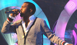
style icon. Kanye West
"I always said if I rap I'd say something significant, but now I'm rapping 'bout money hoes and rims again".
Kanye West is a breakthrough. He has broken the mould that had formed within black music whereby to be cool you had to carry guns, deal drugs, pimp 'hoes' and drive cars 'rollin on 20's' etc. I love the fact that Kanye's confidence allows him to effectively mock this way of life, both through his lyrics and through his fashion sense. As he said on the Friday Night Project, "I wear clothes that fit". He then went on to analyse his outfit, revealing that the majority of his clothes were Dior, and not just the usual hip-hop makes such as Fubu, Echo, etc. By combining styles associated with different music genres (indie ad hip-hop), he has created his own unique style, that only separates him further from the competition.

Kanye West is a breakthrough. He has broken the mould that had formed within black music whereby to be cool you had to carry guns, deal drugs, pimp 'hoes' and drive cars 'rollin on 20's' etc. I love the fact that Kanye's confidence allows him to effectively mock this way of life, both through his lyrics and through his fashion sense. As he said on the Friday Night Project, "I wear clothes that fit". He then went on to analyse his outfit, revealing that the majority of his clothes were Dior, and not just the usual hip-hop makes such as Fubu, Echo, etc. By combining styles associated with different music genres (indie ad hip-hop), he has created his own unique style, that only separates him further from the competition.


16.8.07
HIV awareness

The script reads:
"His mates call him Jack coz he's got a hairy back. He's 6'2" and the best in the box on the pitch. when he was 4 he pushed his primary school teacher in the pond. He lost his virginity when he was 16 on a pool table. By the time he's 40 he wants to drive a Ferrari."

This is an incredibly powerful piece of work by a Graphic Designer from Nottingham Trent University called Ben Kennedy. The use of the body as the medium is so effective. The lack of fonts and the absence of a 'traditional' layout makes it raw, direct and relevant.
Subscribe to:
Posts (Atom)
